The United Nations Development Programme (UNDP) released its Human Development Report 2011. It “argues that the urgent global challenges of sustainability and equity must be addressed together – and identifies policies on the national and global level that could spur mutually reinforcing progress towards these interlinked goals“.
In this report, there is a ranking, the Human Development Index (HDI). The HDI is a way to measure the development. It combines indicators in three main dimensions: health, education and living standards. The mathematical way used to combine these indicators is explained in a technical note (PDF). The interest is of course to have a single number to use in comparison for both social and economic development. It’s not the only element to take into account to compare development. It’s merely a starting point giving an overview of development. An in-depth discussion about development and comparison between countries will need to go further and analyze each indicator separately (as well as other indicators if possible).
But human nature likes rankings. So be it. Here are the top 10 countries according this HDI:
| 1 | Norway | 0.943 |
| 2 | Australia | 0.929 |
| 3 | Netherlands | 0.910 |
| 4 | United States | 0.910 |
| 5 | New Zealand | 0.908 |
| 6 | Canada | 0.908 |
| 7 | Ireland | 0.908 |
| 8 | Liechtenstein | 0.905 |
| 9 | Germany | 0.905 |
| 10 | Sweden | 0.904 |
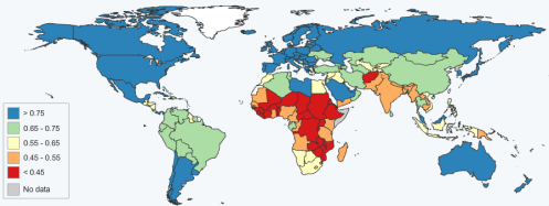
And the 10 least developed countries are all in Africa (again, according to the HDI):
| 178 | Guinea | 0.344 |
| 179 | Central African Republic | 0.343 |
| 180 | Sierra Leone | 0.336 |
| 181 | Burkina Faso | 0.331 |
| 182 | Liberia | 0.329 |
| 183 | Chad | 0.328 |
| 184 | Mozambique | 0.322 |
| 185 | Burundi | 0.316 |
| 186 | Niger | 0.295 |
| 187 | Democratic Republic of the Congo | 0.286 |
For information, China is 101st with an HDI of 0.687 ; Vietnam is 128th with an HDI of 0.593 ; India is 134th with an HDI of 0.547 (all three in the group of medium human development countries).
If I put all this in a map, it gives (thanks to the UNDP Statplanet tool):
The UNDP also has a data explorer tool à-la-Gapminder. Yesterday, I wrote about Hans Rosling’s talk urging us to continue to improve child survival in order to curb the world population growth. If I plot the HDI -vs- the “under-five mortality rate per 1,000 live births” (the probability of dying between birth and exactly age 5, expressed per 1,000 live births), I get the following graph that intuitively makes sense: the smaller is your under-5 mortality rate, the bigger is your HDI (meaning the country is more developed).
Now the HDI is admittedly a theoretical value: it doesn’t take into account inequalities within each specific country. That’s the reason why the UNDP created in 2010 the Inequality-adjusted Human Development Index (IHDI). The IHDI is thus the actual level of human development (taking into account inequality). The average loss in the HDI due to inequality is about 23%. And although the loss is variable from country to country, it increases on average when you go down the human development index (HDI), see figure below. This average loss is the smallest in Europe and Central Asia (-12.7%) and the biggest in Sub-Saharan Africa (-34.5%).


